Analyze the predicted SARS-CoV-2 + VHH-E complex (solutions)
Here, you can find an overview of the conclusions that can be drawn from the outputs that were generated by AlphaFold:
1. Model rankings. The overall model confidence is measured in terms of predicted TM score (PTM). These scores per model are listed in the ranking_debug.json file. This file looks as follows:
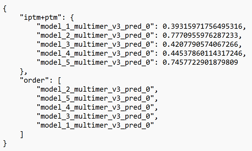
In this file, the PTM score (“iptm+ptm”) is given for each of the five predicted structures. The closer to one, the greater the overall confidence for the model (note: for multimer structures, the weight of the interface region is greater than the other regions). You can see that model #2 is ranked first (in the order part), as it achieves a PTM of 0.78. Model #5 is a close second with a PTM of 0.75. Other models do not go above a score of 0.5. We can conclude that this second model appears to have a high confidence, which is best checked further with the other predicted confidence metrics.
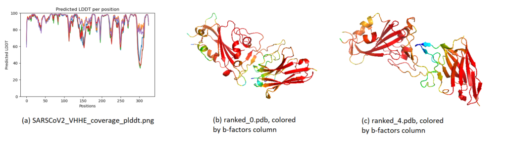
2. PLDDT. The local confidence (per residue) is found by means of PLDDT. These can be visualized in two ways, as shown below. In the visualization, most regions have a very high confidence, meaning that the residues are estimated to fold very accurately locally. This is the case even for the worst model (ranked_5), which only achieved a global PTM of 0.39. Some loop/terminal regions have a slightly lower confidence, as often seen.
3. PAE. The predicted aligned error plots gives an idea of how confidently AlphaFold organizes multiple domains or chains relative to each other. Blue blocks are confident, red/white blocks indicate uncertainty. You can find more information at the “Predicted aligned error tutorial” tab on the AlphaFoldDB.
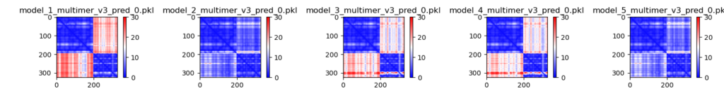
In these visualizations, the second and fifth models (which ranked first and second, with PTMs of 0.78-0.75) show the greatest confidence, with both chains aligning confidently to one another. You can see that the models with much lower PTM scores do not show this characteristic (because of the red blocks). This means that AlphaFold does not predict the interaction properly, despite predicting the individual chains with high accuracy (blue blocks on the top left and bottom right).
4. Aligning predicted structures to 7KN5.
When assessing the PTM scores and PAE plots, there are two top performers (models 2 and 5), two poor performers (models 3 and 4), and one very poor performer (model 1). Let’s align the structures on the SARS-CoV-2 RBD and see how the predicted interactions differ.
Aligning models 2 (cyan) and 5 (grey) (= ranked_0 and ranked_1) shows that the predictions are almost identical.
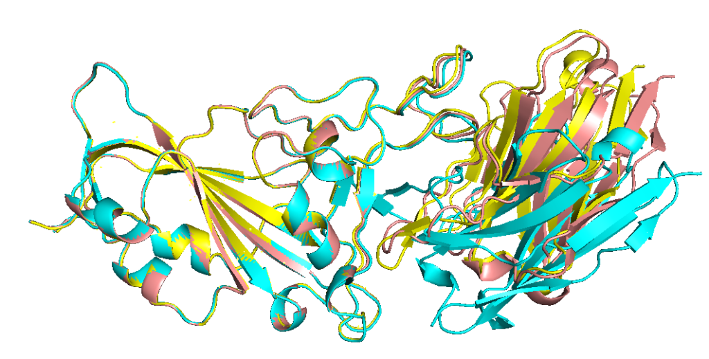
Aligning model 2 (cyan) with models 3 and 4 shows that those two are predicted similarly, but slightly different from model 2.
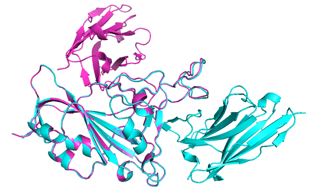
Aligning model 2 (cyan) with model 1 (ranked_4), the prediction with lowest confidence, shows that this prediction is indeed very different from other models.
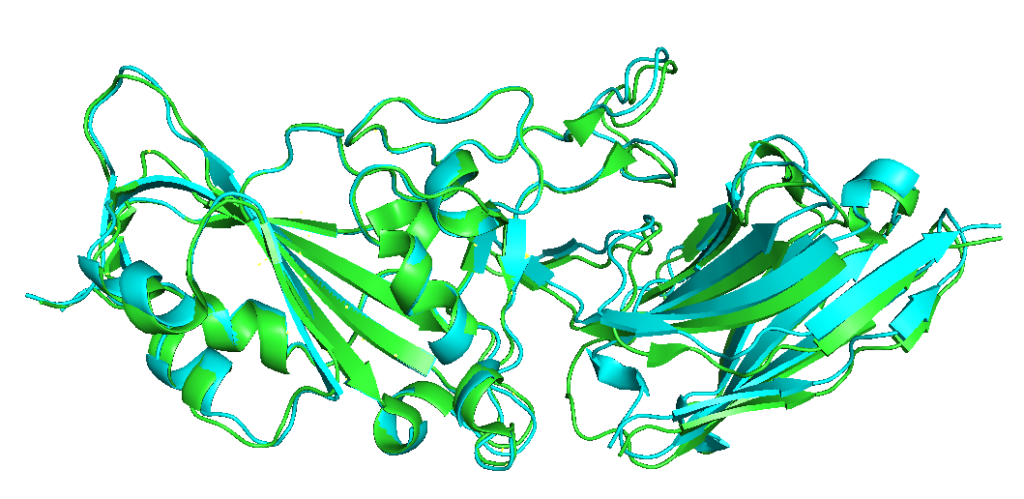
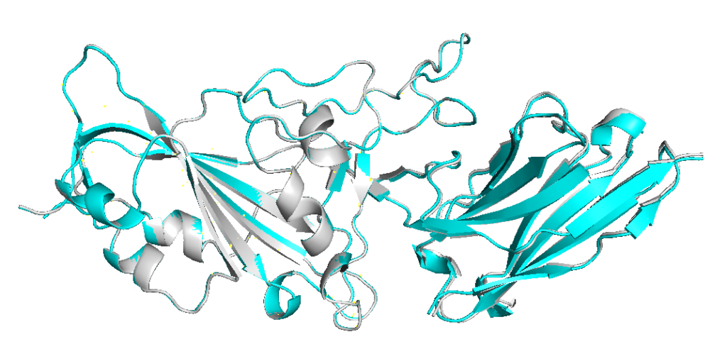
Finally, aligning the top model (model 2, cyan) with the ground truth from PDB (green) shows the similarity between the two.