Correlation
- R Markdown file for this topic
- data set for this topic
What is correlation?
A correlation coefficient measures the strength of the linear relation between 2 variables. There are 2 correlation coefficients:
- Pearson: used for linear/normally distributed/continuous data
- Spearman: used for monotonic/non-normally distributed/discrete data
See this blog for an explanation on the difference between a linear and a monotonic relation.
How to measure correlations?
The code for this part is in an R Markdown file: check the lesson on R Markdown. Put the file and the input data set in the same folder if you want to knit the file.
To calculate correlations we use rcorr() from the Hmisc package. The function can calculate Pearson and Spearman correlation coefficients (via the type argument). If you want to calculate the correlation between
- 2 variables: you define 2 vectors as input (via the x and y arguments)
- more than 2 variables: you define a wide table as input (via the x argument) where each variable is a column in the table
The function also calculates a p-value for each correlation coefficient.
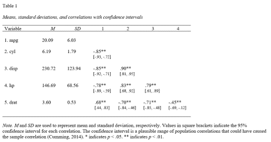
Output in APA style
You can write the correlation matrix to a document in APA style:
library(apaTables)
apa.cor.table(mtcars[1:5],filename="Table1_APA.doc",table.number=1)
will generate a word document in your working directory with the following content:
Visualization of correlations
The most used (but my least preferred) package for visualizing correlations is the corrplot package in R.
I prefer scatter plots so you can see for yourself if the relation is present. In the video below, we explain how to make a scatter plot for 2 variables, and how to check if the data are normally distributed using a density plot.
To create density and scatter plots for more than 2 variables you can use the GGally package. I’m a big fan! It’s a ggplot2 extension so you can add all the ggplot2 layers to adjust the plot.
Add correlation coefficient to the scatter plot
To add the correlation coefficient to a plot use the ggpubr package. First create the scatter plot.
library(ggplot2)
p <- ggplot(mtcars,aes(hp,mpg)) + geom_point()
Then add a regression line and the Pearson correlation coefficient.
library(ggpubr)
p + geom_smooth(method="lm",se=FALSE) + stat_cor(method="pearson")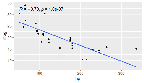
Pearson correlation coefficient and p-value of cor.test() are automatically added to the plot.
Linear transformations will not change the correlation coefficient
Linear transformation (+k, -k, *k, /k where k is a constant) will not change the correlation.
p2 <- ggplot(mtcars,aes(hp+100,mpg)) + geom_point()
p2 + geom_smooth(method="lm",se=FALSE) + stat_cor(method="pearson")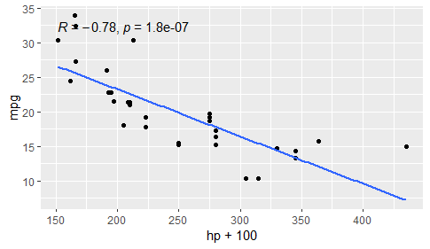
p3 <- ggplot(mtcars,aes(hp,mpg*2)) + geom_point()
p3 + geom_smooth(method="lm",se=FALSE) + stat_cor(method="pearson")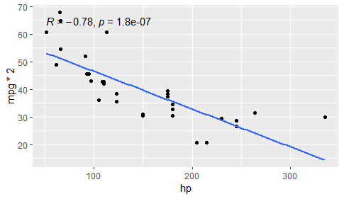
Non-linear transformations can improve the correlation coefficient
A non-linear transformation (log, square root…) can improve the correlation provided the relation between X and Y is non-linear. Check the scatter plot to see if there is a non-linear relation between X and Y. If the relation looks linear don’t do a non-linear transformation.
p4 <- ggplot(mtcars,aes(log(hp),mpg)) + geom_point()
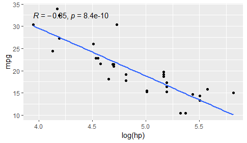
p4 + geom_smooth(method="lm",se=FALSE) + stat_cor(method="pearson")